
Homepage Marketing Test
Homepage Marketing Test
Homepage Marketing Test
Homepage Marketing Test
Homepage Marketing Test
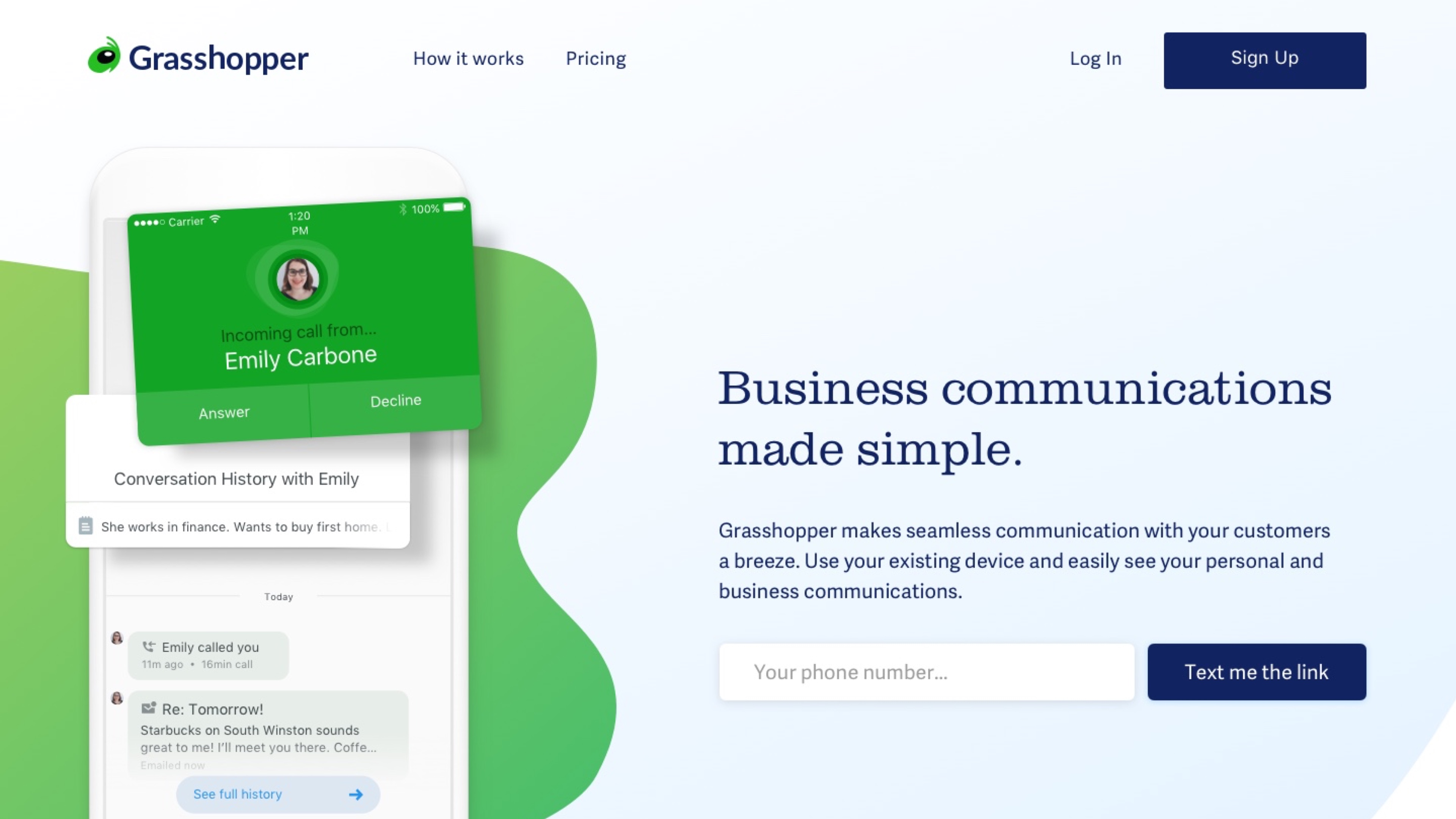
Client : Grasshopper ● Date: March, 2018 ● Role: Product Designer ● Discipline: Brand, Marketing Design, UI
Client : Grasshopper
Date: March, 2018
Role: Product Designer
Discipline: Brand, Marketing Design, UI
Client : Grasshopper
Date: March, 2018
Role: Product Designer
Discipline: Brand, Marketing Design, UI
Client : Grasshopper
Date: March, 2018
Role: Product Designer
Discipline: Brand, Marketing Design, UI
Challenge
This was a cross-functional collaboration between the LogMeIn marketing and product design teams.
We created a series of homepages and then tested them using the BART scale with our target users.
This was a cross-functional collaboration between the LogMeIn marketing and product design teams. We created a series of homepages and then tested them using the BART scale with our target users.
This was a cross-functional collaboration between the LogMeIn marketing and product design teams. We created a series of homepages and then tested them using
the BART scale with our target users.
OUR GOAL
Our goal was to learn how Grasshopper could produce the best version for a future visual update of our brand.
We set up a study with participants to learn how they reacted to different designs.
We wanted to understand what elements or design features resonated with participants to inform these changes.
Our goal was to learn how Grasshopper could produce the best version for a future visual update
of our brand. We set up a study with participants to learn how they reacted to different designs.
We wanted to understand what elements or design features resonated with participants
to inform these changes.
Our goal was to learn how Grasshopper could produce the best version for
a future visual update of our brand. We set up a study with participants to learn how they reacted to different designs. We wanted to understand what elements or design features resonated with participants to inform these changes.
Our goal was to learn how Grasshopper could produce the best version for a future visual update of our brand. We set up a study with participants to learn how they reacted to different designs. We wanted to understand what elements or design features resonated with participants to inform these changes.
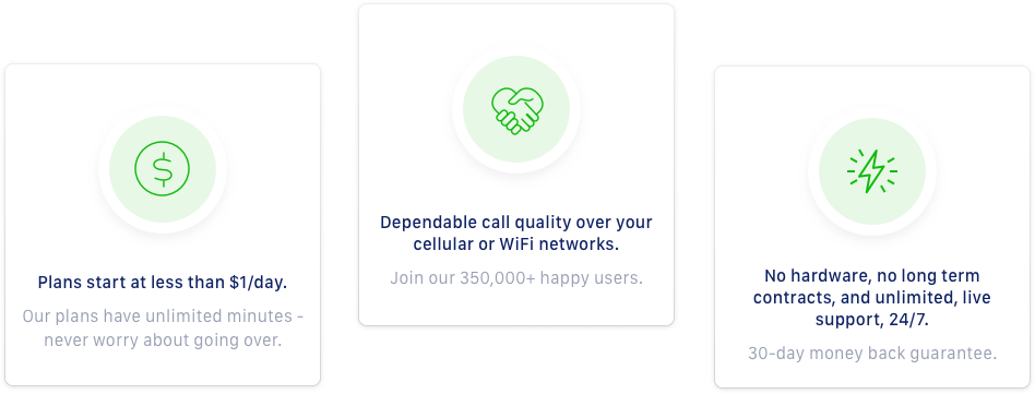
All landing page designs have the same content, but divergent design systems.
All landing page designs have the same content, but divergent design systems.
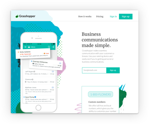
DESIGN A
A
DESIGN B
B
DESIGN C
C
DESIGN D
D
DESIGN E
E
The Study
METHODOLOGY
We had two main components: Remote, unmoderated Sessions through usertesting.com + In-Person interview sessions (7 people).
We had two main components: Remote, unmoderated Sessions through usertesting.com
+ In-Person interview sessions (7 people).
We had two main components: Remote, unmoderated Sessions through usertesting.com
+ In-Person interview sessions (7 people).
We had two main components:
Remote, unmoderated Sessions through usertesting.com + In-Person interview sessions (7 people).
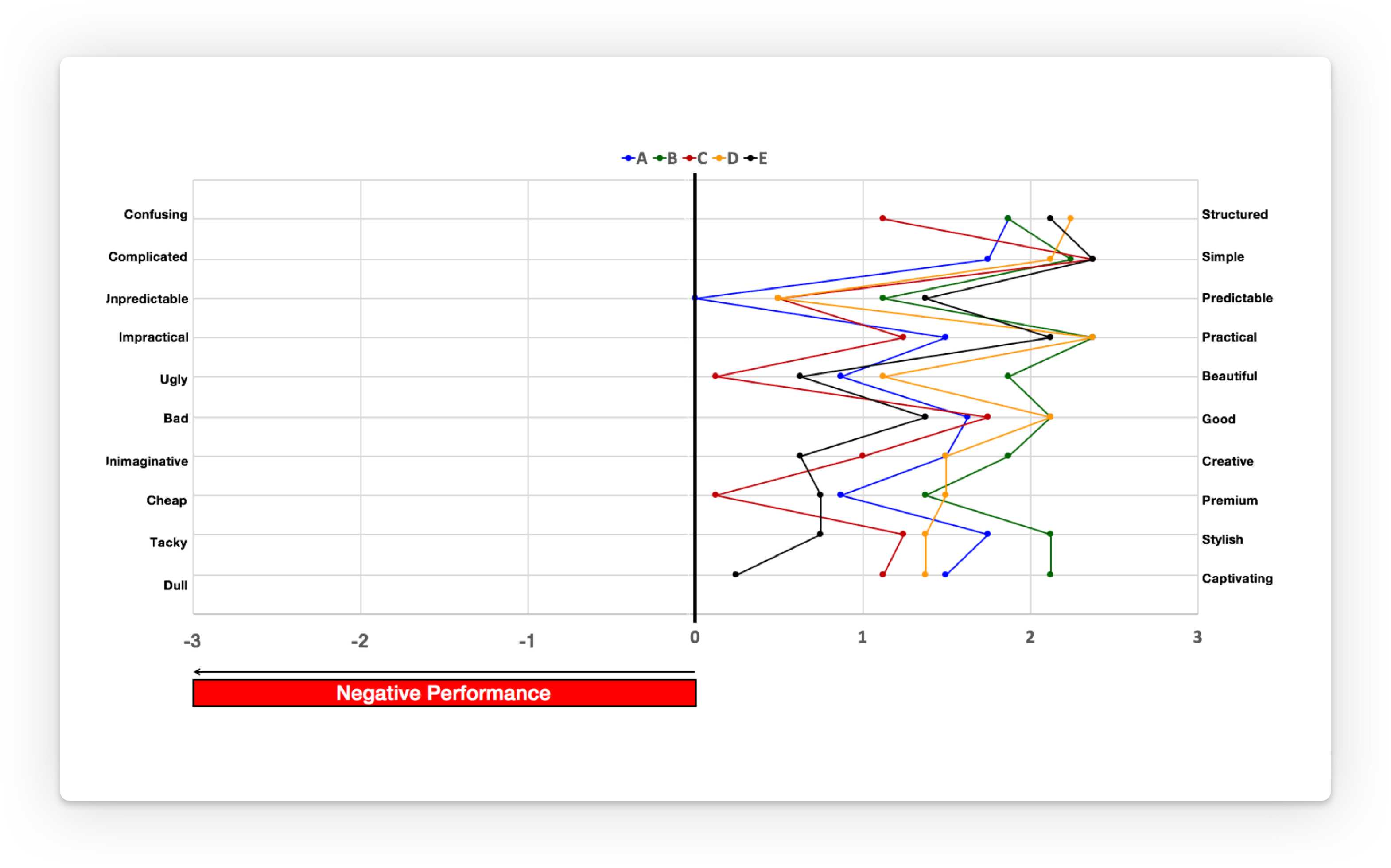
Participants were asked to describe their initial reaction to the presented concept and to select adjectives to describe the presented concept from a closed list of words following the Microsoft Desirability Toolkit methodology. They completed the standardized BERT survey to measure delight and emotional response.
Participants were asked to describe their initial reaction to the presented concept and to select adjectives to describe
the presented concept from a closed list of words following the Microsoft Desirability Toolkit methodology. They
completed the standardized BERT survey to measure delight and emotional response.
Participants were asked to describe their initial reaction to the presented concept and to select
adjectives to describe the presented concept from a closed list of words following the Microsoft Desirability Toolkit methodology. They completed the standardized BERT survey to measure delight
and emotional response.
Participants were asked to describe their initial reaction to the presented concept and to select adjectives to describe the presented concept from
a closed list of words following the Microsoft Desirability Toolkit methodology.
They completed the standardized BERT survey to measure delight
and emotional response.
Participants were asked to describe their initial reaction to the presented concept and
to select adjectives to describe the presented concept from a closed list of words following the Microsoft Desirability Toolkit methodology. They completed the standardized BERT survey to measure
delight and emotional response.
PARTICIPANTS
● A mix of current and prospective Grasshopper users.
● Small business owners/managers, who are responsible for communicating with customers.
● Are aware of virtual phone system products, if not currently using Grasshopper.
● A mix of current and prospective Grasshopper users.
● Small business owners/managers, who are responsible for communicating with customers.
● Are aware of virtual phone system products, if not currently using Grasshopper.
● A mix of current and prospective Grasshopper users
● Small business owners/managers, who are responsible for communicating with customers.
● Are aware of virtual phone system products, if not currently using Grasshopper.
● A mix of current and prospective Grasshopper users.
● Small business owners/managers, who are responsible for
communicating with customers.
● Are aware of virtual phone system products, if not currently
using Grasshopper.
● A mix of current and prospective Grasshopper users.
● Small business owners/managers, who
are responsible for communicating with customers.
● Are aware of virtual phone system products, if not currently using Grasshopper.
The Designs
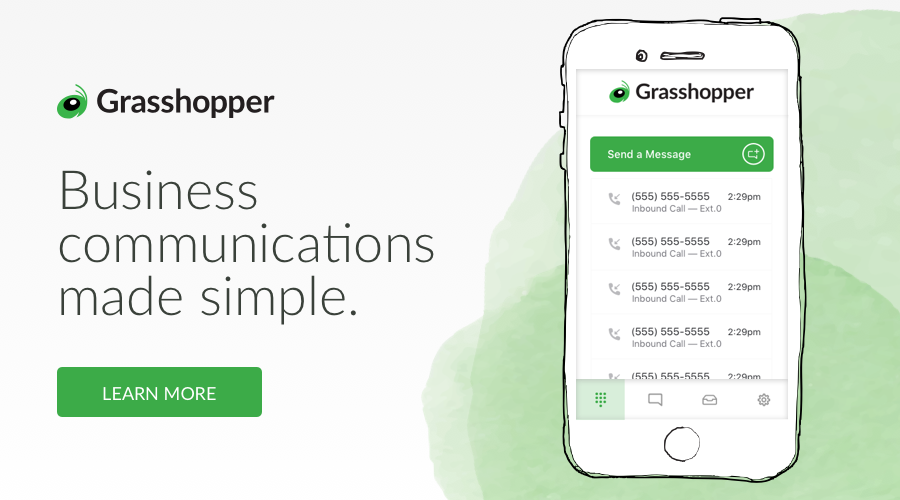
Design A
Participants most often selected the words exciting, friendly and clean to describe this design.
Most participants had a positive reaction toward this approach.
Participants most often selected the words exciting, friendly and clean to describe
this design. Most participants had a positive reaction toward this approach.
Participants most often selected the words exciting, friendly and clean
to describe this design. Most participants had a positive reaction
toward this approach.
Participants most often selected the words exciting, friendly and clean to describe this design. Most participants had a positive reaction toward this approach.
Design A by Erin B Pearson
“Seems like a new communications tool. Things are popping out and there’s a party on the left.” – P00
“Seems like a new communications tool. Things are popping out and there’s a party
on the left.” – P00
“Seems like a new communications tool. Things are popping out and
there’s a party on the left.” – P00
“Seems like a new communications tool. Things are popping out and there’s a party
on the left.” – P00
“I’m feeling happy. I’m feeling excited. This feels like a step up from what I’m using.
More professional, more established.” – P02
“I’m feeling happy. I’m feeling excited. This feels like a step up from what
I’m using. More professional, more established.” – P02
“I’m feeling happy. I’m feeling excited. This feels like a step up from what I’m using. More professional, more established.” – P02
“So, at first I was like ‘wow, I love this!’ Everything was good until I started to scroll down. Then there’s too much.” –P03
“So, at first I was like ‘wow, I love this!’ Everything was good until I started to scroll down.
Then there’s too much.” –P03
“So, at first I was like ‘wow, I love this!’ Everything was good until I started to scroll down.
Then there’s too much.” –P03
“So, at first I was like ‘wow, I love this!’ Everything was good until I started
to scroll down. Then there’s too much.” –P03
“So, at first I was like ‘wow, I love this!’ Everything was good until I started to scroll down. Then there’s too much.” –P03
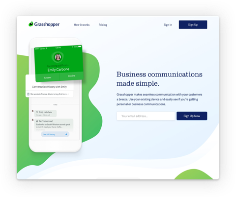
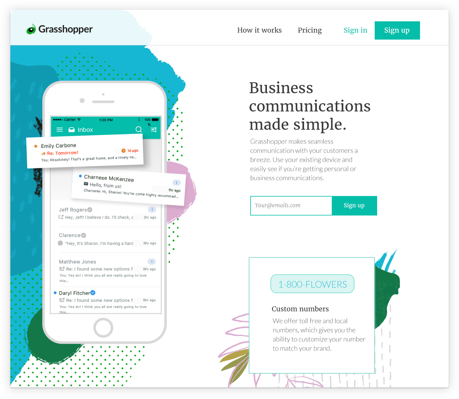
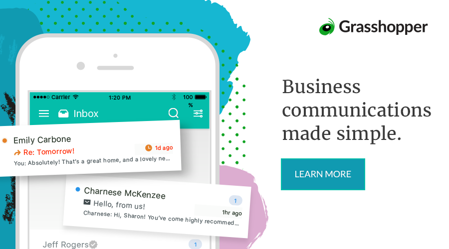
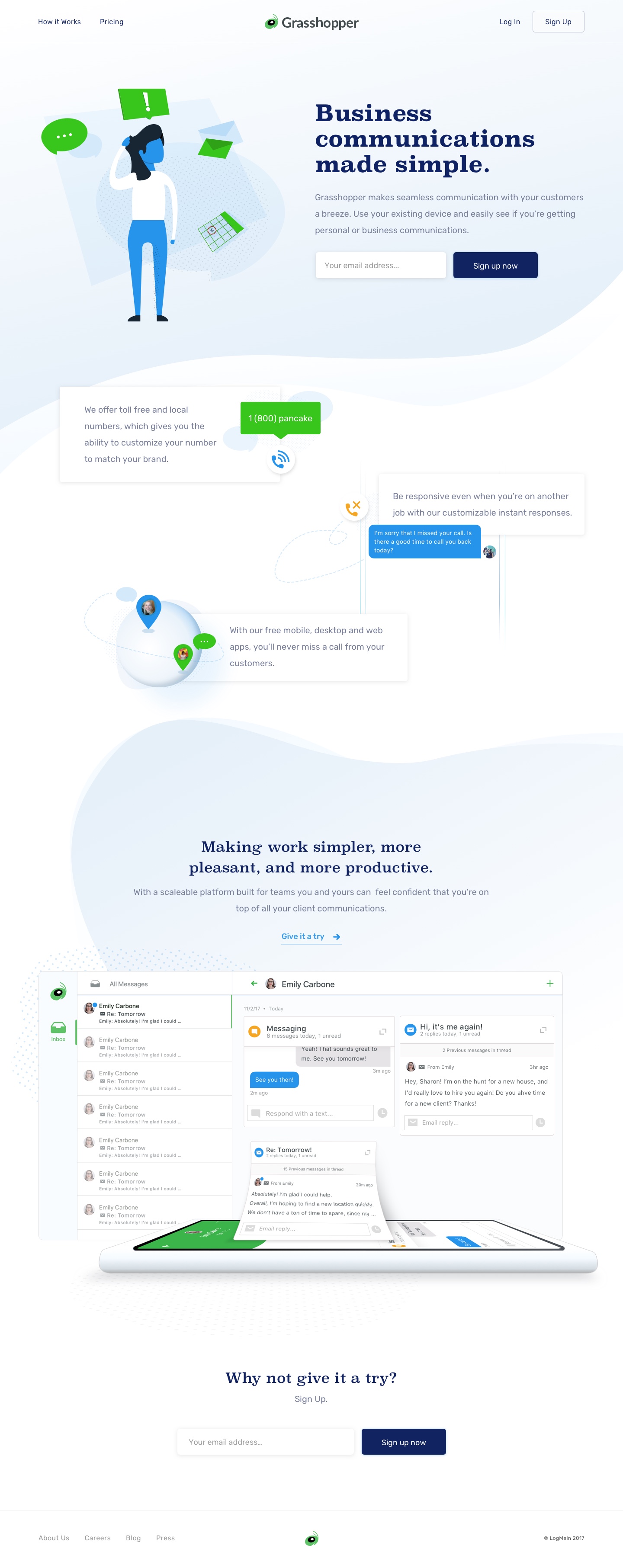
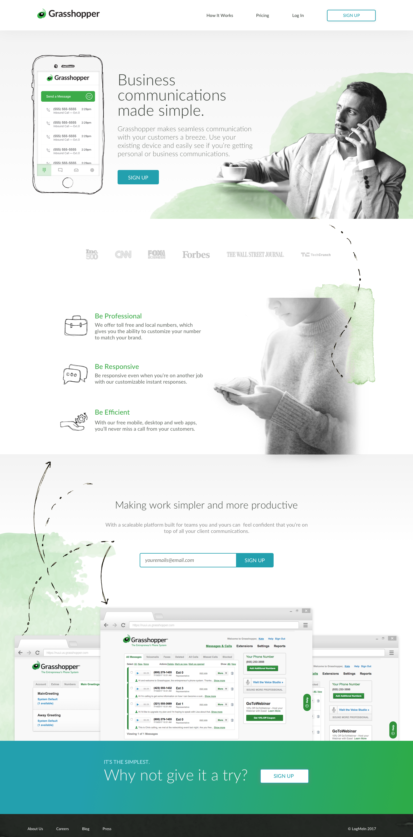
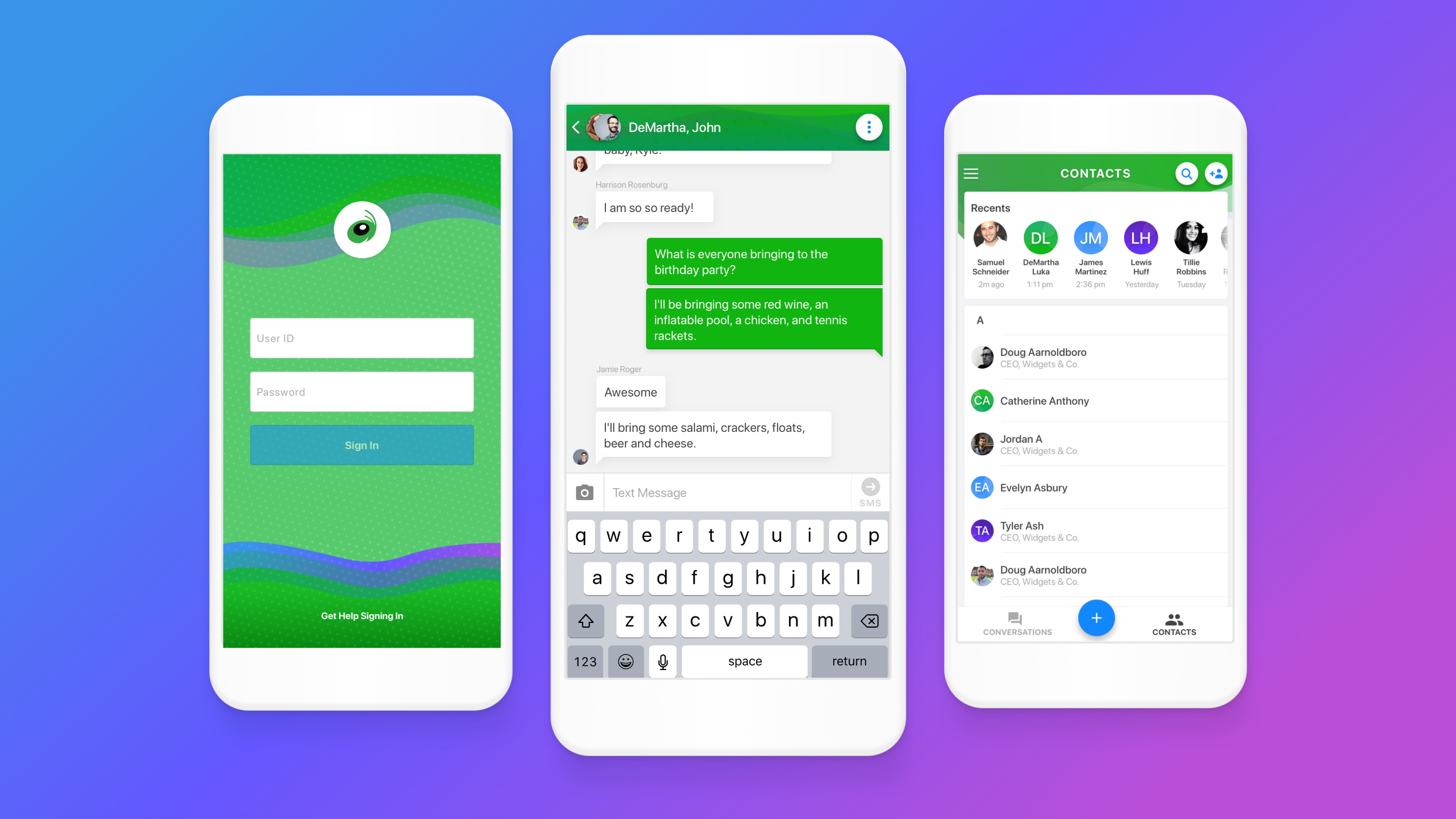
Design B
Participants most often described this design as clean, approachable and calm.
I took ownership of iterating on Design B.
Participants most often described this design as clean, approachable
and calm. I took ownership of iterating on Design B.
Participants most often described this design as clean, approachable and calm. I took ownership of iterating on Design B.
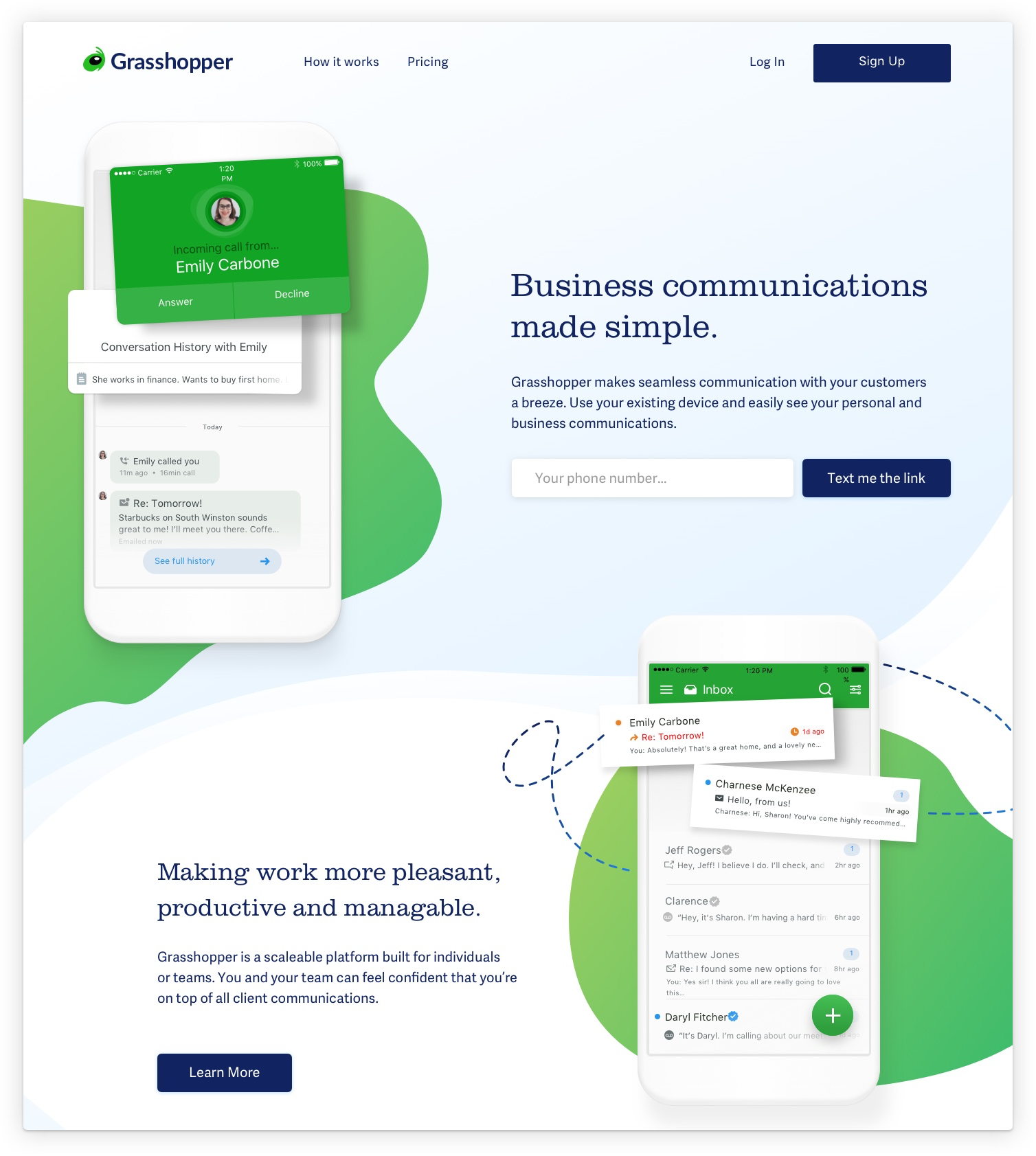
Design B by me, Liz Harris
“I like these nebulous shapes here. Kind of funky and edgy. I think it’s trying to make something
that can be tough to handle – a little more fun and manageable.” – P00
“I like these nebulous shapes here. Kind of funky and edgy. I think it’s
trying to make something that can be tough to handle – a little more fun
and manageable.” – P00
“I like these nebulous shapes here. Kind
of funky and edgy. I think it’s trying
to make something that can be tough to handle – a little more fun and manageable.”
– P00
“It gives me the impression that the people who made it, know what they’re doing.” – P03
“It gives me the impression that the people who made it, know
what they’re doing.” – P03
“It gives me the impression that the people who made it, know what they’re doing.” – P03
“Oh I love the green – very intriguing and fresh.” – Usertesting.com participant
“Oh I love the green – very intriguing and fresh.”
– Usertesting.com participant
“Oh I love the green – very intriguing and fresh.” – Usertesting.com participant
“It seems modern and happy. It’s optimistic, fun, trustworthy.”– Usertesting.com participant
“It seems modern and happy. It’s optimistic, fun, trustworthy.”– Usertesting.com participant
“It seems modern and happy. It’s optimistic, fun, trustworthy.”
– Usertesting.com participant
“It seems modern and happy.
It’s optimistic, fun, trustworthy.”
– Usertesting.com participant
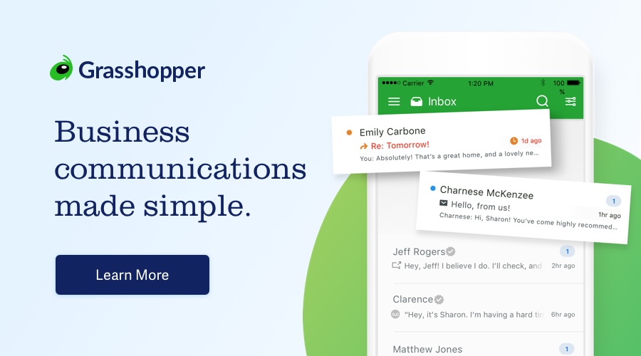
Here's a highlight real of how participants reacted to the design
Here's a highlight real of how participants
reacted to the design
Here's a highlight real of how participants reacted to the design
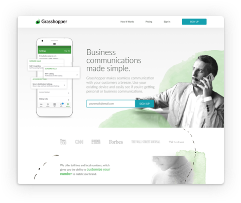
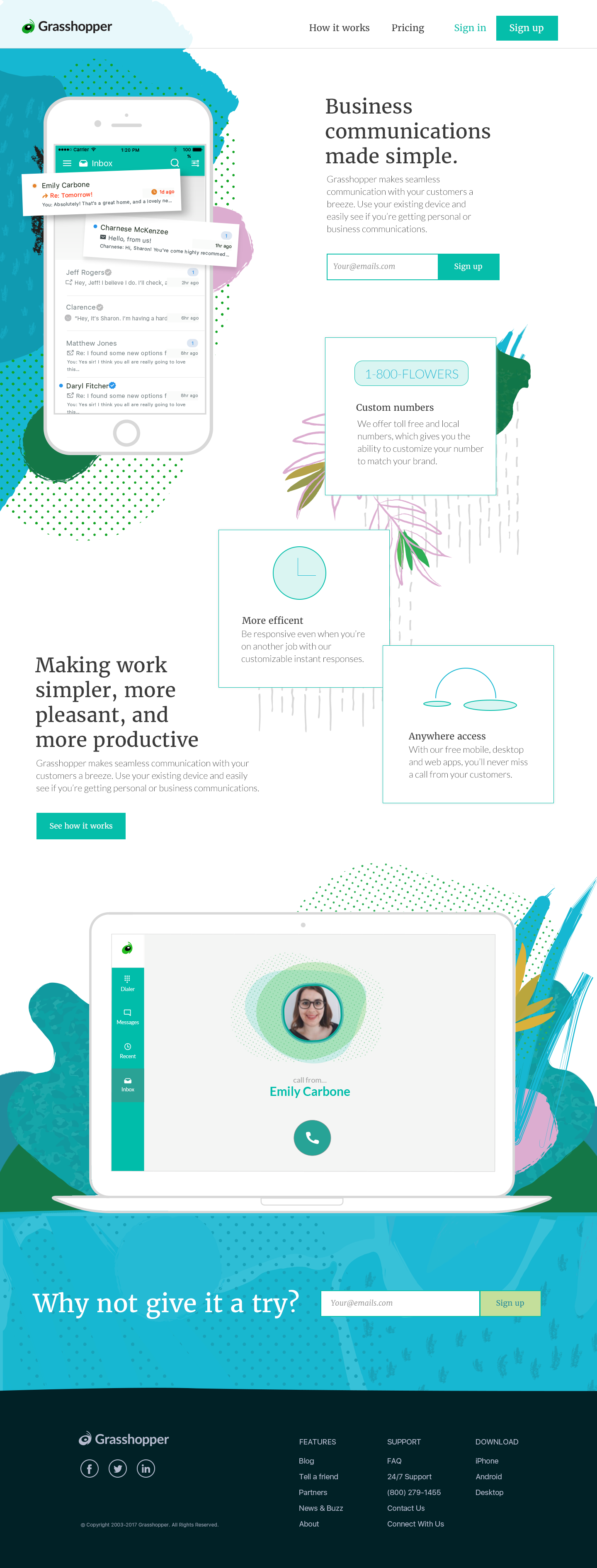
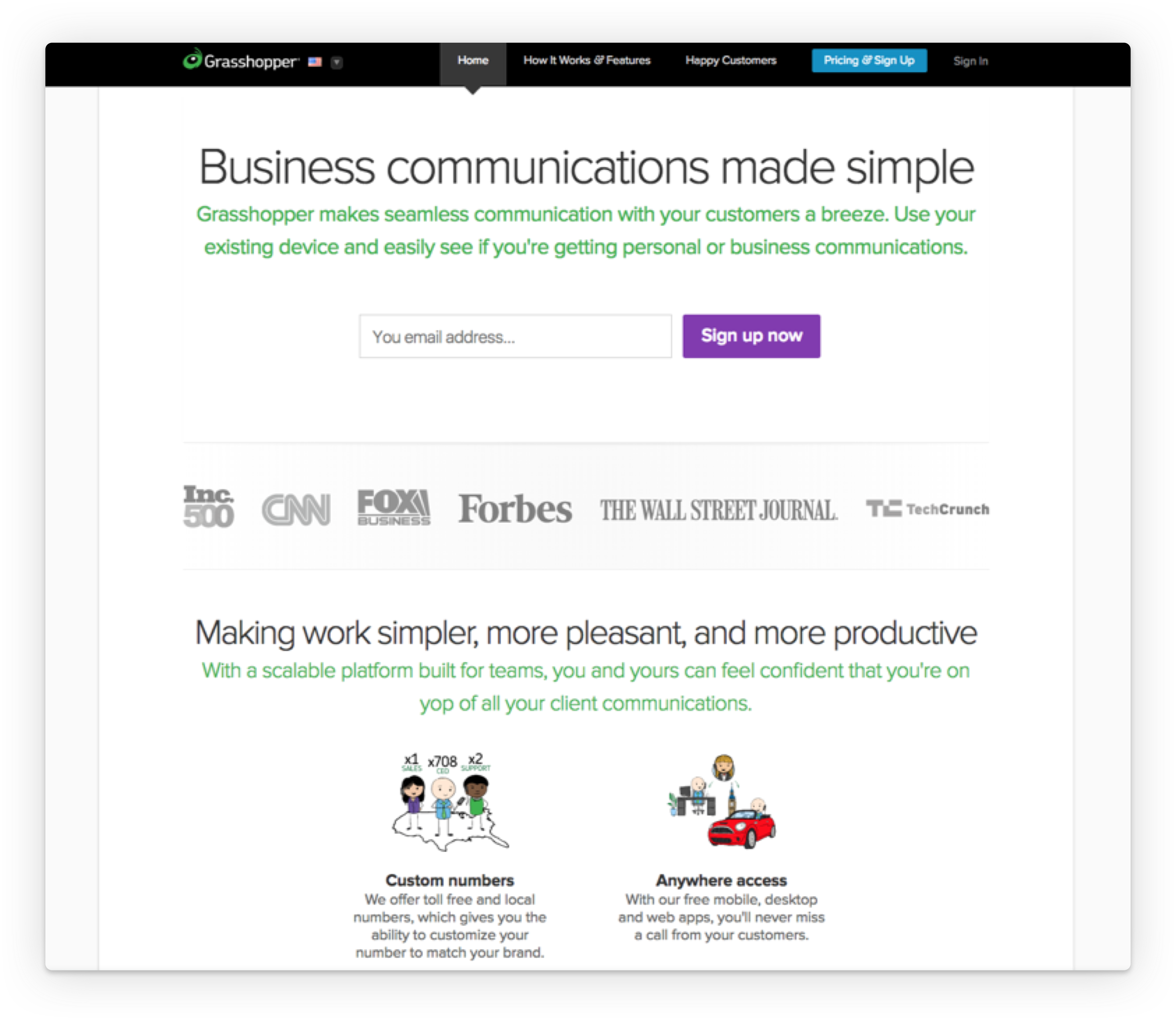
Design C
Appealing, professional, approachable, clean and boring
were used most often to describe this design.
Appealing, professional, approachable, clean and boring were used most often to describe this design.
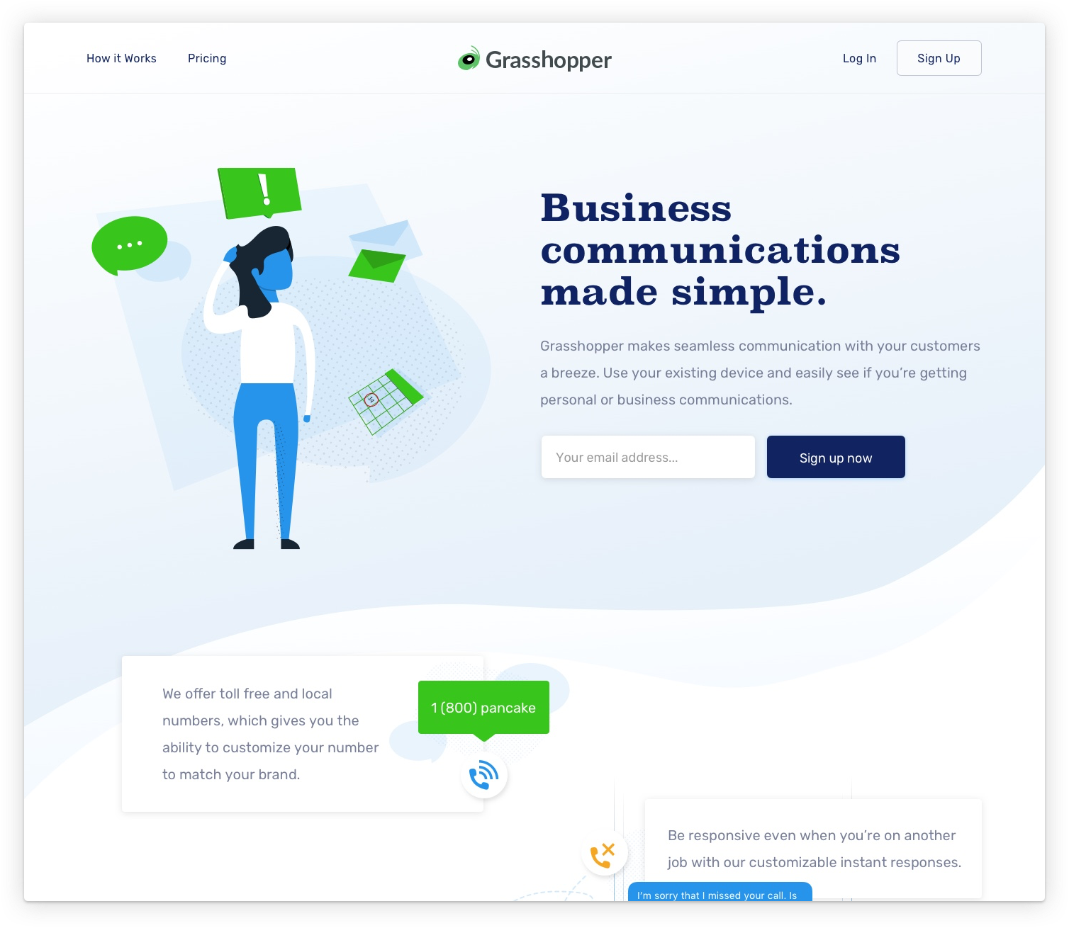
Design C by Chris Davis
Many participants said that they liked the imagery and information included in the second
half of the page, but were confused or put off by the illustration.
Many participants said that they liked the imagery and information included
in the second half of the page, but were confused or put off by the illustration.
Many participants said that they liked the imagery and information included in the second half of the page, but were confused
or put off by the illustration.
“Are you saying that I’m clueless because I’m a woman? What’s the exclamation point?” – P02
“Are you saying that I’m clueless because I’m a woman?
What’s the exclamation point?” – P02
“Are you saying that I’m clueless because
I’m a woman? What’s the exclamation point?”
– P02
“I like the imagery down here (second half) – it’s really showing me what I’m going to get.” – P06
“I like the imagery down here (second half) – it’s really showing
me what I’m going to get.” – P06
“I like the imagery down here (second half)
– it’s really showing me what I’m going
to get.” – P06
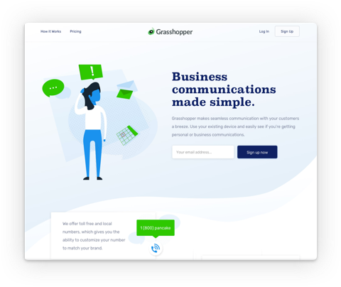
Design D
Participants most often used clean and professional to describe
this design, as well as boring and impersonal.
Participants most often used clean and professional to describe this design, as well
as boring and impersonal.
Design D by Kate Gregorio
Participants had strong negative feelings toward the imagery used in this design,
calling it sad, pensive and masculine.
Participants had strong negative feelings toward the imagery used in this design, calling it sad, pensive and masculine.
Participants had strong negative feelings toward the imagery used in this design, calling it sad, pensive and masculine.
“It’s not pulling me in. I don’t feel warm. Communication is exciting
to me and I don’t know that this is selling passion.” – P02
“It’s not pulling me in. I don’t feel warm. Communication is exciting to me and
I don’t know that this is selling passion.”
– P02
“It seems washed out. Bland. There’s really nothing to grab my attention.” – P04
“It seems washed out. Bland. There’s really nothing
to grab my attention.” – P04
“It seems washed out. Bland. There’s really nothing to grab my attention.” – P04
"It’s like when you get a [picture] frame and there’s some dork in the frame and you’re like I get it,
they have to put a dork in the frame to show you what [the photo] will look like.” – P05
"It’s like when you get a [picture] frame and there’s some dork in the
frame and you’re like I get it, they have to put a dork in the frame to show
you what [the photo] will look like.” – P05
"It’s like when you get a [picture] frame and there’s some dork in the frame and you’re like I get it, they have to put a dork in the frame
to show you what [the photo] will look like.”
– P05
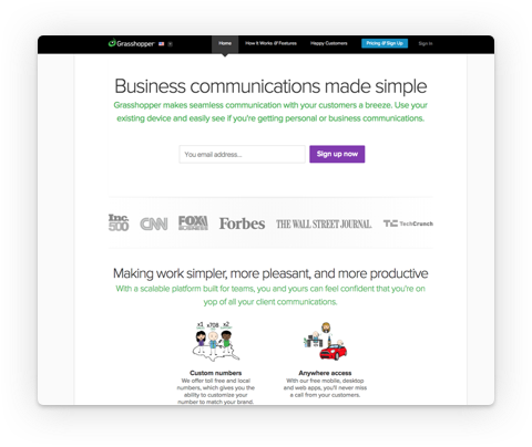
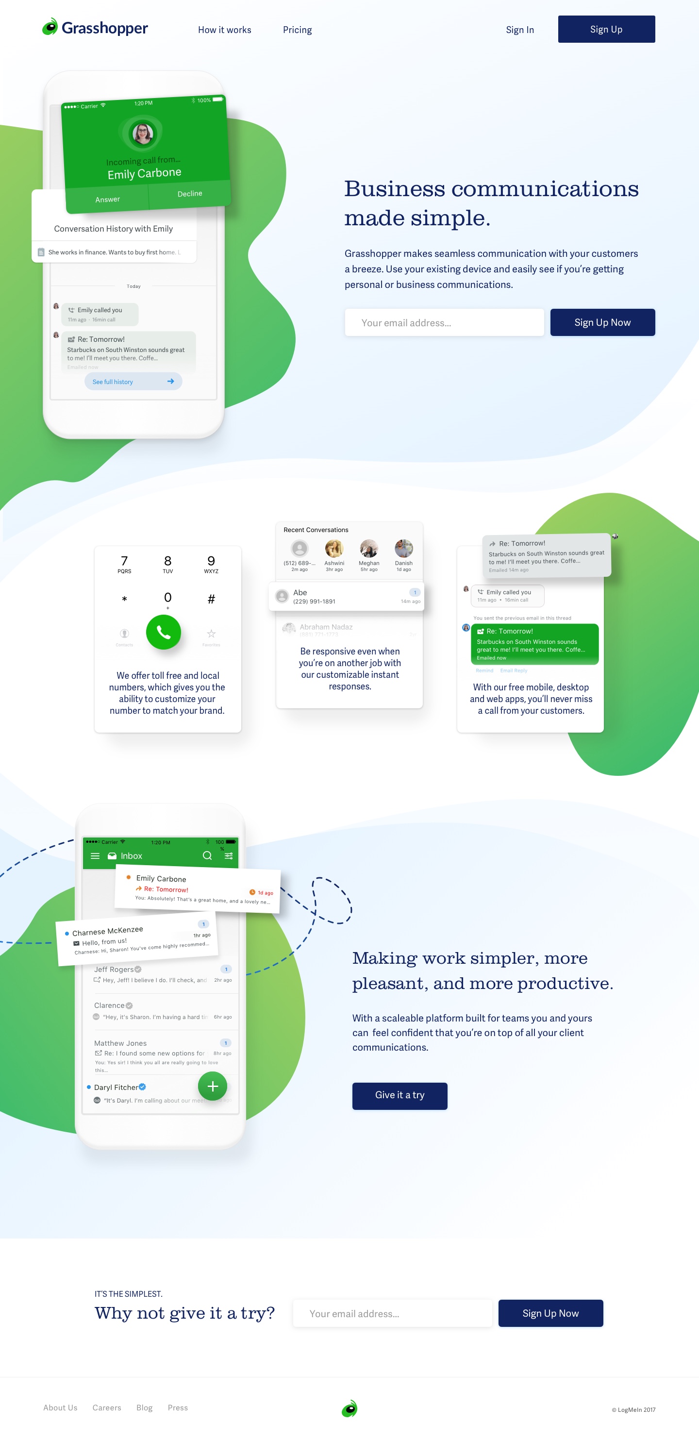
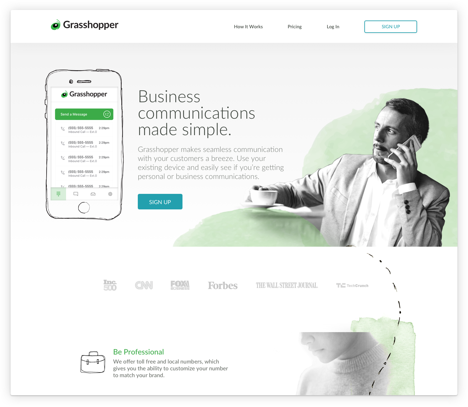
Design E (Current)
Participants commonly selected the words boring, unappealing and impersonal,
as well as clean and professional to describe this design.
Participants commonly selected the words boring, unappealing and impersonal, as well as clean and professional to describe this design.
Participants commonly selected the
words boring, unappealing and impersonal, as well as clean and professional
to describe this design.
Style currently live for Grasshopper.com
Some participants had specific feedback on the illustrations,
calling them amateur, childish and dated.
Some participants had specific feedback on the illustrations, calling them amateur, childish and dated.
“These little cartoons seem a little old, like clip art…Microsoft Word 2007.” – P00
“These little cartoons seem a little old, like clip art…
Microsoft Word 2007.” – P00
“These little cartoons seem a little old, like clip art…Microsoft Word 2007.” – P00
“I think it’s cute, but are you saying it’s more for families or for kids? They’re adults,
but they look like kids to me. To me it didn’t do anything to add to have those cartoons there.” – P01
“I think it’s cute, but are you saying it’s more for families or for kids? They’re adults, but they look like kids to me. To me it didn’t do anything
to add to have those cartoons there.” – P01
“I think it’s cute, but are you saying it’s more for families or for kids? They’re adults, but they look like kids to me. To me it didn’t
do anything to add to have those cartoons there.” – P01
“I would think you’re very young. You haven’t figured out who you are and you’re
trying different things. It’s business, but then it’s cartoons.” – P02
“I would think you’re very young. You haven’t figured out who
you are and you’re trying different things. It’s business, but then
it’s cartoons.” – P02
“I would think you’re very young. You haven’t figured out who you are and you’re trying different things. It’s business, but then
it’s cartoons.” – P02
“The text is serious and then the images and funny, animated, for little kids.” – P03
“The text is serious and then the images and funny, animated,
for little kids.” – P03
“The text is serious and then the images and funny, animated, for little kids.” – P03
“It just seems basic.” – P06
“It just seems basic.” – P06
Findings
Themes we discovered
TRUSTWORTHY & PROFESSIONAL
Testimonials are important, some participants said,
for building trust and professionalism.
Testimonials are important, some participants said,
for building trust and professionalism.
Testimonials are important, some participants said, for building trust and professionalism.
Testimonials are important, some participants said, for building
trust and professionalism.
Testimonials are important, some participants said, for building trust and professionalism.
ENTREPRENEURIAL & HIGH-TECH SPIRIT
Some participants said they are looking for a brand that’s reflective of their entrepreneurial spirit and lifestyle: approachable, not stuffy, laid-back and informal.
Some participants said they are looking for
a brand that’s reflective of their entrepreneurial spirit and lifestyle: approachable, not stuffy,
laid-back and informal.
Some participants said they are looking for a brand that’s reflective
of their entrepreneurial spirit and lifestyle: approachable, not stuffy,
laid-back and informal.
Some participants said they are looking for a brand that’s reflective of their entrepreneurial spirit and lifestyle: approachable, not stuffy, laid-back and informal.
PRODUCT DESCRIPTION
Explaining the Grasshopper product features and communication channels immediately is important.
Explaining the Grasshopper product features
and communication channels immediately
is important.
Explaining the Grasshopper product features and communication
channels immediately is important.
Explaining the Grasshopper product features and communication channels immediately
is important.
ILLUSTRATIONS
The designs which used illustrations to explain the product
or its features, were often misinterpreted by participants.
The designs which used illustrations to explain
the product or its features, were often misinterpreted by participants.
The designs which used illustrations
to explain the product or its features, were often misinterpreted by participants.
Outcome

Design B was the overall winner!
Today, we use styles heavily influenced by Design B in new products
currently being developed at LogMeIn for Grasshopper.
Design B was the overall winner!
Today, we use styles heavily influenced
by Design B in new products currently being developed at LogMeIn for Grasshopper.
FlatIron School AdmissionsProduct Design
LastMail by LastPassProduct Design
Grasshopper for DesktopProject type
care.meProduct Design
Connect Mobile AppProduct Design
The Four Pillars of CollaborationPublic Speaking
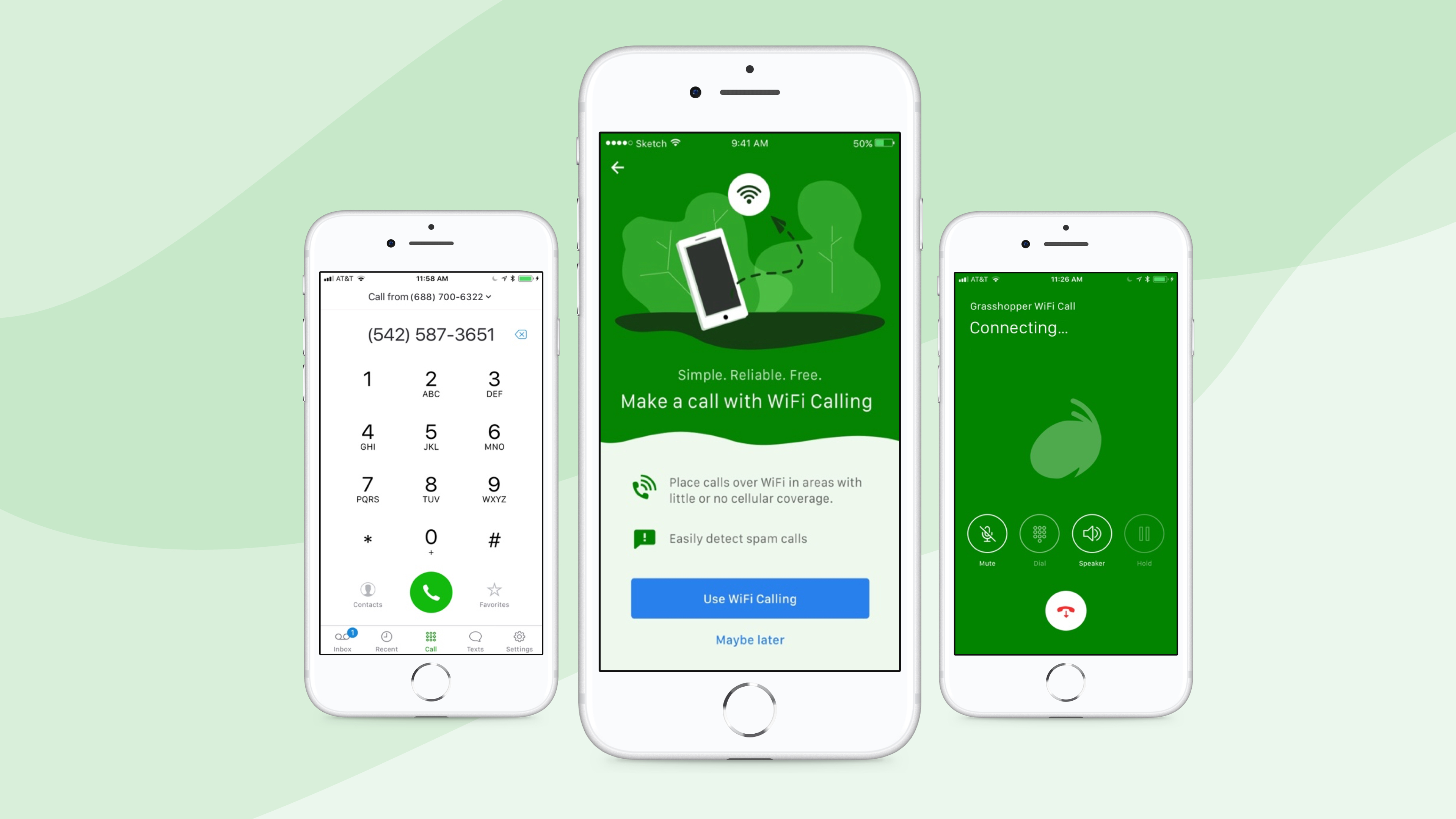
Grasshopper WiFi CallingProduct Design
Homepage Marketing TestRedesign
KodeConnectPrint Design
Building a Cross Product Design SystemDesign Systems

Xively + SalesforceProduct Design
Thanks for viewing my site!
Email me at lizharrisdesign@gmail.com
or follow me on social media!
Thanks for viewing my site!
Email me at lizharrisdesign@gmail.com
or follow me on social media!
Thanks for viewing my site!
Email me at lizharrisdesign@gmail.com
or follow me on social media!